Our-Customers (or Our Clients) page is where you would showcase your Marque Customers and their Success on your website. Today Social Proof is no longer a nice-to-have, but a must-have in your company website from a buyer perspective. Unfortunately, this very Our-Customers page is one of the most “under-utilized” page for most businesses. Therefore there is lot of scope here for making them work for you – in terms of converting your visitors – to leads and customers – by providing credibility and proof to your marketing claims.
Lets see how to make this work for you.
In this article i would be analyzing the Our-Customers page of some impressive companies looking for best practices. We will do this based on below 5 factors. When i say Our-Customers Page – I mean any page or tab where you would list all your social proof, including Customer Names, Testimonials, Videos, Stories, Case Studies, Social Mentions, Social Counts, Media Mentions, Badges, Reviews, etc etc (for more about the different kinds of social proof – read this)
5 Factors to Evaluate Our-Customers (and Our-Clients) Pages
1. Well Organized – Show Where to Start !
Organizing the content such that it is difficult for visitors to figure out where to start is a bad design. Therefore make it clear which is your featured customer or content. Don’t give choices to the visitor ! An A-Z list or filters to start with is a bad idea. Not all your customers are equal. Make up your mind as to which story you want to showcase, and make that clear.
2. Engaging – Make it Interesting !
The content needs to be engaging so that the visitors are inclined to continue, and not close the page. Enough has been said about how visual content is more engaging compared to text. Make it interesting with Photos, Videos, Charts, Graphs, etc.
3. Compelling – Does it Convince to Convert ?
Make sure that the messaging in terms of benefits and value to the customer is clear and it does stand out. Highlight the key takeaways. Make sure it is in sync with your marketing copy. Use metrics and bullet points to show the results post your solution.
4. Credibility – Does it sound Credible as a Social Proof ?
There are many many different kinds of social proof you could collect and show. And it could be company generated or user generated (UGC). I would recommend a mix and match. The more varieties you can show – the better. It helps provide assurance by showing consistency in the opinion across your audience base. Which means less skepticism and more credibility. (for more on which kind of social proof is more credible – read this)
5. Calls-To-Action (CTA) – What is the Next Step ?
The worst thing would be to have a page with dead-ends – the ones where the visitor does not know what to do next , and has to search for a path. I mean in the fortunate case where he/she sticks along. Make sure to connect them to your lead funnel via CTA (Calls To Action) buttons or links.
Now, Lets analyse the Our-Customers Page of some awesome companies, and rate them on a scale of 1-5 for each of the above factors.
(Author’s disclaimer – I am in no way associated with any of these companies. These are hand-picked form the 2014 Forbes Most Promising and Most Admired Companies. Mostly. )
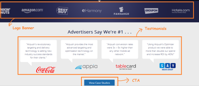
Example 1 – AirPush
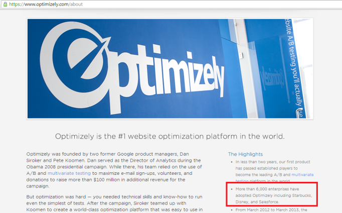
AirPush is #2 on the 2014 Americas Most Promising Companies, and #1 in the Media category. It is a platform for Mobile Ads, with many big names like Coca-Cola, Amazon, Volkswagen, Hotels.com, LG, etc as its customers.
Home Page
Their Our-Customers page is a section in the Home Page. They have 2 sections
1. Logo banner followed with
2. Testimonial Quotes.
Case Studies Page
They also have a case studies page with 3 case studies.

- Organized – 3/5 – There is a limited set of assets, but it is well organized
- Engaging – 2/5 – There is limited content. And the case studies could have been crisper. Interestingly, the PDF versions of the case studies are much better, but given that it is another click away, i am not sure if has been put to good use.
- Compelling – 4/5 – The benefit metrics and the message is clear and therefore compelling.
- Credibility – 3/5 – The brand names are very impressive. They also show some usage and reach statistics like total # of live campaigns, # of mobile apps, etc which is impressive.
- Calls-To-Action (CTA) – 3/5 – The “View Case Studies” CTA on the home page does stand out, but the real one – ‘Create Account” within the case studies page is somewhere at the bottom of the page. Something worth testing.
Overall Score – 15/25 = 3.0
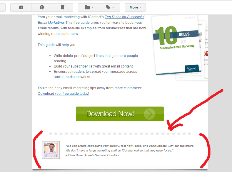
Bonus Tip 1 :
I personally hate PDFs because they are dead ends by design. There is no scope for CTAs. PDFs do allow users to download and read offline, but i do have my doubts on how many people will go back and read offline something that they did not manage to do online, unless of-course you have created something super super engaging. The negatives of PDFs far outweigh the positives.
For more on why not PDFs read this interesting post in The Washington Post – PDFs that Nobody Reads
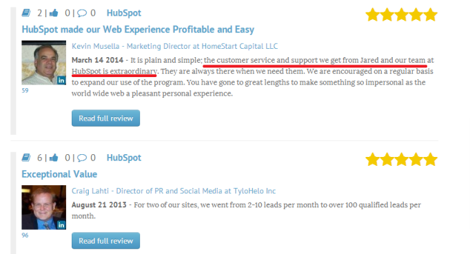
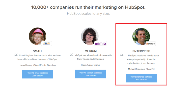
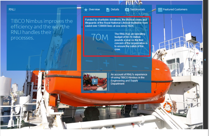
Example 2 – HireVue
HireVue is #10 on the 2014 Americas Most Promising Companies, and #4 in the category – IT Software and Services. It is an online platform for screening and hiring employees. It has Hilton, eBay, Dunkin, GE, etc as its customers.
Our Customers Page
The website has Customers tab as one of it primary tabs. There are 4 sections in the Our-Customers page
1. Featured customers
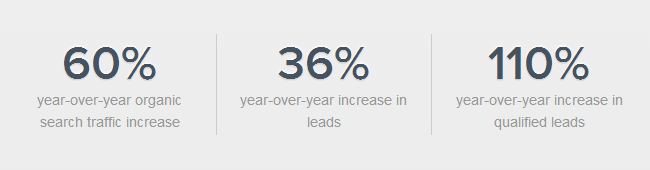
2. Overall customers/reaped benefits stats
3. Story snippets with logo and shoutout
4. Sea of logos


Case Studies Page
The story page typically has a logo, a video, a benefit shout-out (which is cool), and the actual story in the problem-solution-results format. It also has some relevant testimonials quotes. all making it an interesting page.

- Organized – 3/5 – Though there is a clear focus on the featured stories, they are taking all the space and making the rest of the content inaccessible. Added to it the whole image (photo of the customer’s business) is hyper-linked to the respective case study. You cannot avoid not clicking on it. Making it highly unlikely for people to have seen all the nice metrics in the rest of the page.
- Engaging – 4/5 – There is a lot of content in the form of photos, videos, case studies, shout-out metrics, quotes, etc. Everything making it more engaging.
- Compelling – 4/5 – I liked the idea of providing the overall average benefit metrics – Improved quality of hire, Increased speed and productivity, Stronger engagement and satisfaction. I am almost sold on just this 1 section. In my opinion this should have been the top section. It is a shame that no-one would have got to see it because of the issue i mentioned in #1 above.
- Credibility – 4/5 – The combination of the average benefit metrics with the case-studies/testimonials detailing it makes it a great combination. In addition there are those big brand names.
- Calls-To-Action (CTA) – 4/5 – There is a clear and prominent CTA – for taking the Live Demo
Overall Score – 19/25 = 3.8
Bonus Tip 2 :
Showing statistics related to the usage of the product or service is one of the very effective social proofs. Especially if you have some impressive numbers.
Read more about how to use social proof in marketing here – 25 Ways of Using Social Proof in your Marketing
Example 3 – OnDeck
OnDeck is #11 on the 2014 Americas Most Promising Companies, and #2 in the category – Financial Services. It is an online marketplace for business loans trying to disrupt the dominance of traditional banks by easing out the complete process. It has lent ~$825M so far and has many many small businesses as its customers.
Home Page
The home page showcases the featured testimonials along with a photo, which is cool. It makes it very homely and welcoming for the small business owners since they are the target segment. customer persona matched.

Testimonials Page
The Testimonials Page is the equivalent of the Our-Customers page. It has 3 sections
1. Link to Reviews on TrustPilot
2. Kudos mentions/posts in social media, and Yelp
3. Testimonials by Industry

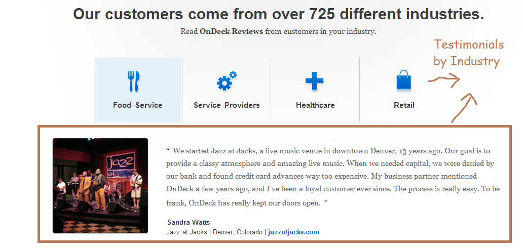
- Organized – 4/5 – It is organized well from a visitor perspective, but maybe the ones that link to 3rd party platforms should be lower down to reduce the risk of link leakage.
- Engaging – 4/5 – There is a variety of content making it interesting.
- Compelling – 4/5 – The benefit metrics and the message is clear and compelling
- Credibility – 5/5 – In addition to the testimonials, the addition of the reviews from the 3rd party platforms like Twitter, Facebook, Yelp and TrustPilot makes it very credible.
- Calls-To-Action (CTA) – 4/5 –
Overall Score – 21/25 = 4.2
Bonus Tip 3 :
I love it when companies don’t limit themselves to just company generated content like testimonials, videos or case studies. User generated content (UGC) like reviews on 3rd party platforms, social media mentions, etc add a lot of credibility, and it works magic when you showcase both.
for more on this read my article on What is a Better Social Proof – Company-Generated OR User-Generated ?
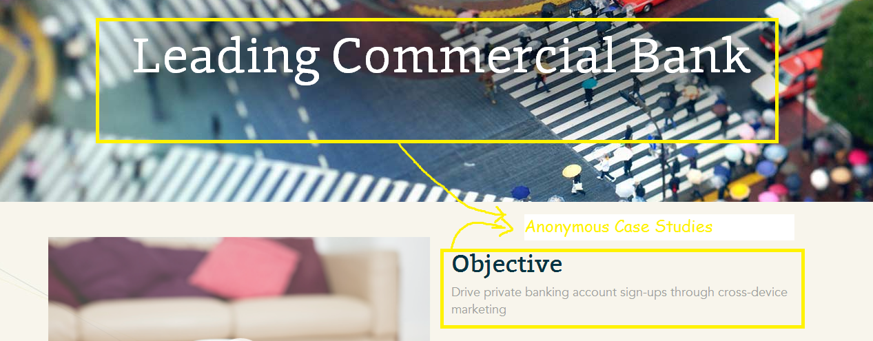
Example 4 – Tapad
Tapad is #12 on the 2014 Americas Most Promising Companies, and #5 in the category – IT Software & Services. It helps online advertisers to track and target consumers across various devices – desktop, tablet and smartphone.
Home Page
The home page gives a summary of their Our-Customers. they have 2 sections
1. Badges of Top X out of Y Companies in Z Industry Segment
2. Interesting mix of Media Mentions, Influencer Endorsements and Testimonials

Case Studies Page
The Case Studies page has a listing of 6 anonymous case studies from 6 different industries each. And each of the individual case studies look like the one below.
- Organized – 5/5 – The section on the home page gives a very good start. I love the way they have made an interesting mix of all the social proofs – Top X out of Y Companies Badges, Media Mentions like the Forbes Ranking, Frost & Sullivan Award, Endorsements from Influencers (like the one from Evidon CEO), Testimonials (like the one from Dell)
- Engaging – 2/5 – There is not much details after the great summary.
- Compelling – 3/5 – The benefit metrics and the message is fair but not outright compelling.
- Credibility – 3/5 – Tapad is using “privacy” as their USP, and as a result there are no customer names. So from a credibility perspective, the proof points score low. They could have made up for it by displaying other social proofs that don’t involve naming a customer.
- Calls-To-Action (CTA) – 1/5 – No clear CTA.
Overall Score – 14/25 = 2.8
Bonus Tip 4 :
If you are in a business where you cannot take the names of your customer, either due to the nature of the industry or because for your own reasons, you can still showcase credibility by using social proofs that does not involve customer names. examples would be – endorsements from 3rd parties or influencers in the industry, usage statistics like # transactions, benefit statistics like average improvement, media mentions, awards, partnerships, etc etc. see all the 22 different kinds of social proof here.
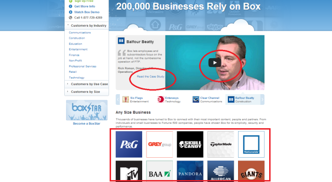
Example 5 – CollectiveBias
CollectiveBias is #18 on the 2014 Americas Most Promising Companies, and #1 in the category – Business Services & Supplies. It is a platform to connect freelance blogger with companies for creating content. It has an impressive lineup of customers like Nestle, Walmart, Starbucks, Sears, Walgreens, etc
Home Page
The Home page showcases the featured testimonials.

Our Work Page
The Our Work Page is the Our-Customer equivalent here. It showcases the case studies.

Case Studies Page
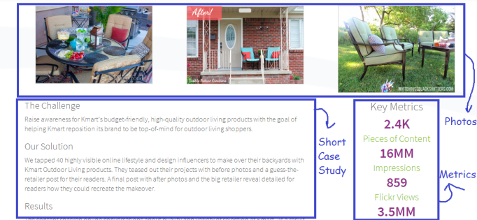
- Organized – 3/5 – The featured testimonials and the featured case studies gives a good start.
- Engaging – 2/5 – Given that CollectiveBias is a content platform, the social proof content showcased falls short in terms of the opportunity to engage.
- Compelling – 3/5 – The metrics are good to give an idea of the reach of the content, but does not really provide a competitive edge. Not compelling enough to take that next step.
- Credibility – 3/5 – Impressive names like Nestle and Disney make it sound credible.
- Calls-To-Action (CTA) – 2/5 – the CTA that is visible is the “Subscribe” to the newsletter, which is probably not a very good use of the Customer Successes.
Overall Score – 13/25 =2.6
Bonus Tip 5 :
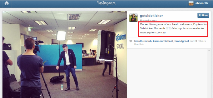
It is a proven fact that people pay more attention to visual content than just text. Adding visual elements to the content makes it more interesting and hence engaging. Therefore add more photos, videos, charts, info-graphics, screenshots, etc to your Our-Customer pages.
see this article in Under30CEO on why visual content makes sense
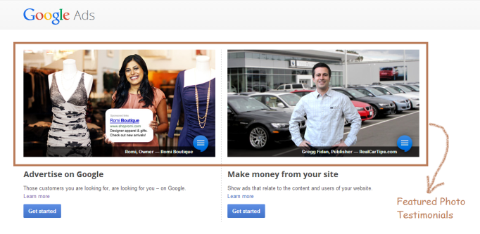
Example 6 – Google Adwords
Google is #1 in the 2014 Forbes Most Admired Companies. Of-course ! We are interested only in the Google Adwords business for this exercise since that is the selling angle.
Home Page
The Home Page shows 2 featured testimonials – one each for the Adwords (for Advertisers) and Adsense (for website owners who rent out advertising space)
Success Stories Page
The Stories page consists of customer success stories in the form of videos or case studies. The page is divided into 2 sections
1. Small and Medium Business
2. Fortune 500


- Organized – 3/5 – Google does highlight some of its success stories in other pages, which is good. In the Success Stories page it has tried to organize it based on the customer persona – small/medium businesses versus big enterprises.
- Engaging – 3/5 – The videos look interesting and good therefore making the small/medium business section more engaging than the Fortune 500 section. The case studies could have been much better.
- Compelling – 3/5 – Given that it is Google and it has access to a lot of resources, the content could have been better in terms of showing the BEFORE-and-AFTER scenario. None of the material do a great job of explaining why you should do Ads in Google. If it is not for the proven fact that search ads work, it would have been a challenge to compel people to go for it with just these stories.
- Credibility – 3/5 – Many popular brands
- Calls-To-Action (CTA) – 4/5 – The CTA of “Get Started Now” along with the 1-800 number is clear and stands out.
Overall Score – 16/25 =3.2
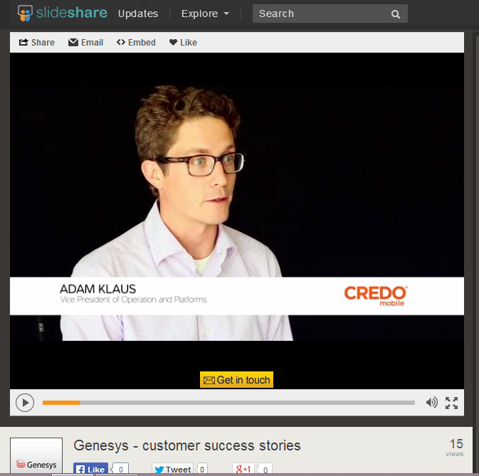
Bonus Tip 6 :
Customer Videos is a social proof that can be very effective if done right. The key would be to keep it short, make it interesting by storytelling, having the right CTA, providing a preview and promoting it in all places.
To know more read this article – How to make your Video Testimonials Work ?
Example 7 – Twitter
Home Page
The Home Page features a prominent section linking to the success stories. It also showcases some featured stories of popular brands like Nat Geo, Adidas.

Success Stories Page
The Success Stories Page is the Our-Customers page for Twitter. It showcases a summary video which is cool.

Case Study Page
The Case Study page is very interesting consisting of the typical problem-solution-benefits. In addition it has some related “tweets”. Also it has some relevant testimonial quotes. Twitter also takes the opportunity to highlight the features/offering and ties it to the challenge-benefits. Overall, it is engaging.


- Organized – 4/5 – All 3 pages are organized well – The home page section, the success stories page, and the detailed story page.
- Engaging – 5/5 – The content is made interesting by including tweets, testimonials, takeaway shout-outs, key success factors, photos and feature description.
- Compelling – 5/5 – The Take-away shout-outs and the best practices do a good job of explaining the value proposition.
- Credibility – 5/5 – The popular brands and the tweet embeds, along with all the detailing make it look credible.
- Calls-To-Action (CTA) – 3/5 – the “start advertising” is kind-of lost at the top. this could have been placed better. Needs testing.
Overall Score – 22/25 =4.4
Bonus Tip 7 :
Customer Case Studies and Success Stories are very powerful as a Content Marketing Tactic because it has the added advantage of having the power of 3 –
1. Informative (as a Content Category)
2. Credible (as a Social Proof)
3. Selling (as a Marketing Copy)
Read more about it here – How to Make your Case Studies and Success Stories Boost your Marketing ?
Conclusion
Now if you are wondering why none of them got a 5 ? well ..this is a reason
That is because there is scope for doing a lot with your Our-Customers Page. What you saw above were some great ideas, but there is definitely lots more. Watch out this space for the “Perfect Our-Customers Page” !
Meanwhile, if you have some awesome ideas please do share by commenting. And if you find this article useful, please SHARE it.
Appreciate it. Thanks, Anupam
……………………………………………………………